Abstract
This module describes features often used in printed publications. Most
of the specified functionality involves some sort of generated content
where content from the document is adorned, replicated, or moved in the
final presentation of the document. Along with two other CSS3 modules –
multi-column layout and paged media – this module offers advanced
functionality for presenting structured documents on paged media. Paged
media can be printed, or presented on screens.
Status of this
document
This is a public copy of the editors' draft. It is provided for
discussion only and may change at any moment. Its publication here does
not imply endorsement of its contents by W3C. Don't cite this document
other than as work in progress.
The (archived) public
mailing list
www-style@w3.org (see instructions) is preferred for
discussion of this specification. When sending e-mail, please put the text
“css3-gcpm” in the subject, preferably like this:
“[css3-gcpm] …summary of comment…”
This document was produced by the CSS Working Group (part of
the Style Activity).
This document was produced by a group operating under the 5 February
2004 W3C Patent Policy. W3C maintains a public list of any patent disclosures made in
connection with the deliverables of the group; that page also includes
instructions for disclosing a patent. An individual who has actual
knowledge of a patent which the individual believes contains Essential
Claim(s) must disclose the information in accordance with section
6 of the W3C Patent Policy.
This WD contains functionality that the CSS WG finds interesting and
useful. In general, the earlier a feature appears in this draft, the more
stable it is. Significant changes in functionality and syntax must be
expected from paged presentations and
onwards. Also, functionality described in this module may be moved to
other modules. Since the previous WD,
this specification has been alinged with existing implemenatation. Some
functionality has been removed (e.g., env(), target-pull()), or moved to
other modules (the styling of blank pages). Some functionality are used in
this draft with the expectation that it will appear in other modules (border-clip).
The definition of some properties has changed (e.g., the ‘start’ keyword) or been further clarified based on
feedback on www-style.
Introduction
(This section is not normative.)
This specification describes features often used in printed
publications. Some of the proposed functionality (e.g., the new list style
types, and border segments) may also used with other media types. However,
this specification is monstly concerned with paged media.
To aid navigation in printed material, headers and footers are often
printed in the page margins. [CSS3PAGE] describes how to place
headers and footers on a page, but not how to fetch headers and footers
from elements in the document. This specification offers two ways to
achieve this. The first mechanism is named
strings which copies the text (without style, structure, or
replaced content) from one element for later reuse in margin boxes. The
second mechanism is running elements which
moves elements (with style, structure, and replaced content) into
a margin box.
1.1. Named strings
Named strings can be thought of as variables that can hold one string of
text each. Named strings are created with the ‘string-set’ property
which copies a string of text into the named string. Only text is copied;
not style, structure, or replaced content.
Consider this code:
h1 { string-set: title content(text) }
Whenever an h1 element is encountered, its textual content
is copied into a named string called title. Its content can be
retrieved in the ‘content’ property:
@page :right { @top-right { content: string(title) }}
1.1.1.
Setting named strings: the ‘string-set’ property
| Name:
| string-set
|
| Value:
| [[ <identifier> <content-list>] [, <identifier>
<content-list>]* ] | none
|
| Initial:
| none
|
| Applies to:
| all elements
|
| Inherited:
| no
|
| Percentages:
| N/A
|
| Media:
| all
|
| Computed value:
| as specified value
|
The ‘string-set’ property accepts a comma-separated
list of named strings. Each named string is followed by a content list
that specifies which text to copy into the named string. Whenever an
element with value of ‘string-set’ different from ‘none’ is encountered, the named strings are assigned
their respective value.
<content-list> expands to one or more of these values, in any order:
- <string>
- a string, e.g. "foo"
- <counter>
- the counter() or counters() function, as per CSS 2.1 section
4.3.5
- contents()
- The textual content of the element, including the content
of its ::before and ::after pseudo-element. The content of the element's
descendants, including their respective ::before and ::after
pseudo-elements, are included in the returned content.
- content(text)
- The textual content of the element, not including the content of its
::before and ::after pseudo-element. The content of the element's
descendants, including their respective ::before and ::after
pseudo-elements, are included in the returned content. This is the
default value, so ‘
content()’ is equivalent to
‘content(text)’.
- content(before)
- The textual content of the ::before pseudo-element the content of the
element.
- content(after)
- The textual content of the ::after pseudo-element the content of the
element.
- content(first-letter)
- The first letter of the content of the element. The definition of a
letter is the same as for :first-letter pseudo-elements.
- env()
- This function returns data from the local environment of the user at
the time of formatting. The function accepts one of these keywords:
- env(url): returns the URL of the document
- env(date): returns the date on the user's system at the time of
formatting
- env(time): returns the time on the user's system at the time of
formatting
- env(date-time): returns the date and time on the user's system at
the time of formatting
Information about date and time is formatted according to the locale
of the user's system.
Or, should there be a way to specify the locale? Or should
we simply format all in ISO format (e.g., 2010-03-30)?
On many systems, preformatted strings in the user's locale
can be found through the strftime
function. The date, time and date-time strings can be found by using the
"%x", "%X" and "%c" conversion strings, respectively.
@page {
  @top-right { content: env(url) }
  @bottom-right { content: env(date-time) }
}
Named strings can only hold the result of one assignment; whenever a new
assignment is made to a named string, its old value is replaced.
User agents, however, must be able to remember the result of
more than one assignment as the ‘string()’
functional value (described below) can refer to different assignments.
The scope of a named string is the page of the element to which the
‘string-set’
property is attached and subsequent pages.
The textual content is processed as if ‘white-space:
normal’ had been set.
h2 {
  string-set: header "Chapter " counter(header) ": " content();
  counter-increment: header;
}

<h2>Europa</h2>
Note that the string called "header" is different from the counter with
the same name. The above code may result in the string called "header" is
set to "Chapter 2: Europa".
This example results in the same value being assigned to
header as in the previous example.
h2:before { content: "Chapter " counter(header) }
h2 {
  string-set: header content(before) content(text);
  counter-increment: header }
dt { string-set: index first-letter }
The content is copied regardless of other settings on the element. In
HTML, TITLE elements are normally not displayed, but in this example the
content is copied into a named string:
title {
  display: none;
  string-set: tittel content();
}
1.1.2. Using named
strings
The content of named strings can be recalled by using the ‘string()’ value on the ‘content’ property. The ‘string()’ value has one required argument, namely the
name of the string.
@page { @top-center { content: string(header) }}
@page { @right-middle { content: string(index) }}
@page { @top-left { content: string(entry) }}
h1 { string-set: header "Chapter " counter(chapter) content() }
dt { string-set: index first-letter, entry content() }
If the value of the named string is changed by an element on a certain
page, the named string may have several values on that page. In order to
specify which of these values should be used, an optional argument is
accepted on the ‘string()’ value. This argument
can have one of four keywords:
- ‘
first’: the value of the first assignment
on the page is used. If there is no assignment on the page, the named
string's entry value is used. The entry value is the value held by the
string at the end of the previous page. ‘first’ is the default value.
- ‘
start’: the value of the first assignment
on the page is used if the element begins the page or the named string
has not been assigned a value. Otherwise, the named string's entry value
is used.
- ‘
last’: the named string's exit value is
used
- ‘
first-except’: similar to ‘first’, except on the page where the value was
assigned. On that page, the empty string is used.
The assignment is considered to take place on the first page where a
content box representing the element occurs. If the element does not have
any content boxes (e.g., if ‘display: none’ is
set), the assignment is considered to take place on the page where the
first content box would have occured if the element had been in the normal
flow.
In this example, the first term on the page will be shown in the top
left corner and the last term on the page will be shown in the top right
corner. In top center of the page, the first letter of first term will be
shown.
@page { @top-left { content: string(term, first) }}
@page { @top-right { content: string(term, last) }}
@page { @top-center { content: string(index, first) }}
dt { string-set: index content(first-letter), term content(text) }
Given this CSS code:
h2 { string-set: header content() }
The value of the "header" string
| page#
| HTML code
| first
| start
| last
| first-except
|
| 1
|
<h1>Continents</h1>
...
<h2>Africa</h2>
...
...
| Africa
| Africa
| Africa
|
|
| 2
|
...
<h2>Americas</h2>
...
<h2>Asia</h2>
...
| Americas
| Africa
| Asia
|
|
| 3
|
...
...
...
...
| Asia
| Asia
| Asia
| Asia
|
| 4
|
<h2>Europe</h2>
...
<h2>Oceania</h2>
..
| Europe
| Europe
| Oceania
|
|
In this example, the term that is being described at the start of the
page is shown in the top left header.
@page { @top-left { content: string(term, start) }}
dt { string-set: term content() }
@page { @top-left { content: string(term, first) }}
@page { @top-right { content: string(term, last) }}
@page { @top-center { content: string(index, first) }}
dt { string-set: index content(first-letter), term content(text) }
In this example, the header in the top center will be blank on pages
where ‘h1’ elements appear. On other pages,
the string of the previous ‘h1’ element will
be shown.
@page { @top-center { content: string(chapter, first-except) }}
h1 { string-set: chapter content() }
If the named string referred to in a ‘string()’ value has not been assigned a value, the
empty string is used.
1.2. Running elements
Named strings, as described above, can only hold textual content; any
style, structure or replaced content associated with the element is
ignored. To overcome this limitation, a way of moving elements into
running headers and footers is introduced.
Elements that are moved into headers and footers are repeated on several
pages; they are said to be running
elements. To support running elements, a new value – running()
– is introduced on the ‘position’
property. It has one required argument: the name by which the running
element can be referred to. A running element is not shown in its natural
place; there it is treated as if ‘display:
none’ had been set. Instead, the running element may be displayed
in a margin box.
Like counters and named strings, the name of a running element is chosen
by the style sheet author, and the names have a separate name space. A
running element can hold one element, including its pseudo-elements and
its descendants. Whenever a new element is assigned to a running element,
the old element is lost.
User agents, however, must be able to remember the result of
more than one assignment as the ‘element()’
value (described below) can refer to different assignments.
Running elements inherit through their normal place in the structure of
the document.
title { position: running(header) }
@page { @top-center {
  content: element(header) }
}
Like the ‘string()’ value, the ‘element()’ value accepts an optional second argument:
- ‘
start’
- ‘
first’
- ‘
last’
- ‘
first-except’
The keywords have the same meaning as for the ‘string()’ value, and the place of the assignments are
the same.
The ‘element()’ value cannot be combined with
any other values.
In this example, the header is hidden from view in all media types
except print. On printed pages, the header is displayed top center on all
pages, except where h1 elements appear.
<style>
  div.header { display: none }
  @media print {
  div.header {
    display: block;
    position: running(header);
  }
  @page { @top-center { content: element(header, first-except) }}
</style>
...
<div class="header">Introduction</div>
<h1 class="chapter">An introduction</div>
This code illustrates how to change the running header on one page in
the middle of a run of pages:
...
<style>
@page { @top-center {
  content: element(header, first) }}
.header { position: running(header) }
.once { font-weight: bold }
</style>
...
<div class="header">Not now</div>
<p>Da di ha di da di ...
  <span class="header once">NOW!</span>
  <span class="header">Not now</span>
  ... da di ha di hum.</p>
...
The header is "Not now" from the outset, due to the "div" element. The
first "span" element changes it to "
NOW!" on the page where the
"span" element would have appeared. The second "span" element, which would
have appeared on the same page as the first is not used because the
‘
first’ keyword has been specified. However,
the second "span" element still sets the exit value for "header" and this
value is used on subsequent pages.
2. Leaders
A leader is a visual pattern that guides the eye. Typically, leaders are
used to visually connect an entry in a list with a corresponding code. For
example, there are often leaders between titles and page numbers in a
table of contents (TOC). Another example is the phone book where there are
leaders between a name and a telephone number.
In CSS3, a leader is composed of series of glyphs through the ‘leader()’ value on the ‘content’ property. The functional notation accepts
two values. The first describes the glyph pattern that makes up the
leader. These values are allowed:
- leader(dotted)
- leader(solid)
- leader(space)
- leader(<string>)
Using the keyword values is equivalent to setting a string value. The
table below shows the equivalents:
| Keyword
| String
| Unicode characters
|
| leader(dotted)
| leader(‘. ’)
| \002E \0020
|
| leader(solid)
| leader(‘_’)
| \005F
|
| leader(space)
| leader(‘ ’)
| \0020
|
User Agents should attempt to align corresponding glyphs from the leader
pattern between consecutive lines.
The string inside the parenthesis is called the leader string.
In its simplest form, the ‘content’
property only takes one ‘leader()’ value:
heading::after { content: leader(dotted) }
The leader string must be shown in full at least once and this
establishes the minimum length of the leader. To fill the available space,
the leader string is repeated as many times as possible in the writing
direction. At the end of the leader, a partial string pattern may be
shown. White space in the leader string is collapsed according to the
values on white-space properties.
These properties influence the appearance of leaders: all font
properties, text properties, ‘letter-spacing’, white-space properties,
background properties, and ‘color’.
The second value describes the alignment of the leader. These values
are allowed:
- align
- attempt to align corresponding glyphs from the leader pattern between
consecutive lines. This is the default value.
- start
- align leader string with the start
- end
- align leader string with the end
- center
- center leader string
- string-space
- add space between strings to take up all available space
- letter-space
- add space between letters (both inside the string, and at the
start/end of the string) to take up all available space
heading::after { content: leader(dotted, align) }
heading::after { content: leader(dotted, start) }
heading::after { content: leader(dotted, end) }
heading::after { content: leader(dotted, center) }
heading::after { content: leader(dotted, string-space) }
heading::after { content: leader(dotted, letter-space) }
In a more complex example, the ‘leader’
value is combined with other values on the ‘content’ property:
ul.toc a::after {
  content: leader(". . . ") target-counter(attr(href url), page);
}
If the content connected by a leader end up on different lines, the
leader will be present on all lines. Each leader fragment honors the
minimum length of the leader.
Consider this code:
<style>
.name::after { content: leader(dotted) }
</style>
<div class="entry">
<span class="name">John Doe</span>
<span class="number">123456789</span>
</div>
If the name and number end up on different lines (e.g., in a narrow
column), it may be formatted like this:
John Doe....
...123456789
To determine the length of the leaders, user agents must do the
following for each line:
- Lay out the content with leaders of minimum lengths
- Determine the empty space left on the line.
- Distribute the empty space between the leaders on the line. Glyphs
must not be shown partially. All leaders on the line should, to the
extent possible, have the same length. This may not always be possible as
the minimum leader length must be honored.
- Fill the empty space with the specified leader pattern.
Consider this code:
<style>
cite::before { content: leader('  ') }
</style>
<blockquote>
  For a moment, nothing happend.
  Then, after a second or so,
  nothing continued to happen.
    <cite>Douglas Adams</cite>
</blockquote>
Depending on the width of the containing block, this may be rendered
as:
 |For a moment, nothing happend.  |
 |Then, after a second or so,     |
 |nothing continued to happen.    |
 |                   Douglas Adams|
If the containing block is wider, this may be the resultant
presentation:
 |For a moment, nothing happend. Then,    |
 |after a second or so, nothing continued |
 |to happen.                 Douglas Adams|
3. Cross-references
It is common to refer to other parts of a document by way of a section
number (e.g., "See section 3.4.1"), a page number (e.g., "See discussion
on page 72"), or a string (e.g., "See the chapter on Europe"). Being able
to resolve these cross-references automatically saves time and reduces the
number of errors.
3.1.
The ‘target-counter’ and ‘target-counters’ values
Numerical cross-references are generated by ‘target-counter()’ and ‘target-counters()’ values that fetch the value of a
counter at the target end of the link. These functions are similar to the
‘counter()’ and ‘counters()’ functions, except that they fetch counter
values from remote elements. ‘target-counter()’
has two required arguments: the url of the link, and the name of a
counter. ‘target-counters()’ has three required
arguments: the url of the link, the name of a counter, and a separator
string. Both functions accepts an optional argument at the end that
describes which list style type to use when presenting the resulting
number; ‘decimal’ being the default.
This style sheet specifies that a string like " (see page 72)" is added
after a link:
a::after { content: "(see page " target-counter(attr(href url), page, decimal) ")" }
This style sheet specifies that a string like " (see section 1.3.5)" is
added after a link:
a::after { content: "(see section " target-counters(attr(href url), section, ".", decimal) ")" }
3.2. The ‘target-text’ value
Textual cross-references are generated by ‘target-text()’ which fetches the textual content from
the target end of the link. Only text is copied; not style, structure, or
replaced content. ‘target-text()’ has one
required argument: the url of the link. An optional second argument
specifies exactly which content is fetched. There are four possible
values: ‘content’,
‘before’, ‘after’,
‘first-letter’; these keywords are defined
above.
To generate this text:
See Chapter 3 ("A better way") on page 31 for an in-depth evaluation.
from this markup:
<p>See <a href="#chx">this chapter</a> for an in-depth evaluation.
...
<h2 id="chx">A better way</h2>
this CSS code can be used:
h2 { counter-increment: chapter }
a { content: "Chapter " target-counter(attr(href url), chapter)
   ' ("'  target-text(attr(href url), content) '") on page '
   target-counter(attr(href url), page);
When an element is turned into a footnote, certain things happen: the
element is moved to the footnote area, a footnote call is left behind in
its place, a footnote marker is displayed before the element, and the
footnote counter is incremented.
A footnote is a note typically placed at the bottom of a page that
comments on, or cites, a reference. References to footnotes are marked
with a footnote call in the main text which corresponds to a
footnote marker in the footnote area. The rendering of
footnotes is complex. As far as possible, footnotes try to reuse other
parts of CSS. However, due to the typographic traditions of footnotes,
some new functionality is required to support footnotes in CSS:
- one new value on the ‘
float’ property:
‘footnote’
- one new page area: ‘
@footnote’
- two new pseudo-elements: ‘
::footnote-call’
and ‘::footnote-marker’
- one predefined counter: ‘
footnote’
- one new value on the ‘
content’ property: ‘target-pull()’
- border segments (see border-clip)
- super-decimal
In its simplest form, making a footnote is simple.
<style>
.footnote { float: footnote }
</style>

<p>A sentence consists of words. <span class="footnote">Most often.</span>.
In this example, the text Most often.
will be placed in a
footnote. A note-call will be left behind in the main text and a
corresponding marker will be shown next to the footnote. Here is one
possible rendering:
A sentence consists of words. ¹

¹ Most often.
To support legacy browsers, it is often better to make a link to the
note rather than including the text inline. This example shows how to
fetch the content of a note and place it in a footnote.
<style>
@media print {
  .footnote {
    float: footnote;
    content: target-pull(attr(href url)) }
  .call { display: none }
}
</style>
...
<p>A sentence consists of words<a class="footnote" href="#words"> [3]</a>.
...
<p id=words><span class="call">[3]</span> Most often.
define ‘target-pull’
When shown in a legacy browser, the content of the element will be
shown as a clickable link to an endnote. When printed according to this
specification, there will be a footnote:
A sentence consists of words¹.

¹ Most often.
Consider this markup:
<p>Sorry, <span title="This is, of course, a lie.">we're closing for lunch</span>.
The content of the "title" attribute can be turned into a footnote with
this code:
span[title]::after {
  content: attr(title);
  float: footnote;
}
An element with ‘float: footnote’ (called a
footnote element) is moved to the footnote area and a
footnote-call pseudo-element is put in its original place.
span.footnote {
  float: footnote;
}
Footnote elements are presented inside the footnote area, but
they inherit through their normal place in the structure of the document.
The ‘display’ property on footnote
elements is ignored. Instead, the value of the ‘display’ property in the @footnote context
determines if footnotes are block or inline elements.
In this example, the footnotes are displayed inline:
@footnote {
  display: inline;
}
span.footnote {
  float: footnote;
}
Here is one possible presentation of inline footnotes:
¹ The first footnote. º The second footnote.
For each new footnote element, the ‘footnote’
counter is automatically incremented.
All elements with ‘float: footnote’ are moved
to the footnote area. The footnote area is described by an
@footnote-rule inside the @page-rule. By default, the footnote area
appears at the bottom of the page, but it can be positioned in other
places.
Should the footnote are be positioned using page floats or
(fixed?) absolute positioning? Or both?
These rules place the footnote area at the bottom of the page, spanning
all columns:
@page {
  @footnote {
    float: bottom;
    column-span: all;
    width: 100%;
  }
}
These rules place the footnote area at the bottom of the first column:
@page {
  @footnote {
    float: bottom;
    width: 100%;
  }
}
This code places the footnote area at the bottom of the right column:
@page {
  @footnote {
    float: bottom-corner;
    width: 100%;
  }
}
The content of the footnote area is considered to come before other
content which may compete for the same space on the same page.
@page { @footnote { float: bottom page}}
div.figure { float: bottom page }
If figures and footnotes are on the same page, the footnotes will
appear below the figures as they are floated to the bottom before the
figures.
Potentially, every page has a footnote area. If there are no footnotes
on the page, the footnote area will not take up any space. If there are
footnotes on a page, the layout of the footnote area will be determined by
the properties/values set on it, and by the footnote elements elements
inside it.
These properties apply to the footnote area: ‘content’, ‘border’, ‘padding’, ‘margin’, ‘height’,
‘width’, ‘max-height’, ‘max-width’, ‘min-height’, ‘min-width’, the background properties.
This example uses some of the applicable properties on @footnote:
@footnote {
  margin-top: 0.5em;
  border-top: thin solid black;
  border-clip: 4em;
  padding-top: 0.5em;
}
The result of this code is a footnote area separated from other content
above it by margin, border and padding. Only 4em of the border is visible
due to the ‘border-clip’ property, which
is defined in CSS
Backgrounds and Borders Module Level 4. .
When an element is moved to the footnote area, a footnote-call
is left behind. By default, User Agents must behave as if this code is
part of the default style sheet:
::footnote-call {
  content: counter(footnote, super-decimal);
}
The resulting note call is a super-script decimal number.
A ::footnote-marker pseudo-element is added to each footnote element, in
the same place, and replacing, the ::before pseudo-element. User agents
must, by default, show the "footnote" counter in the footnote-marker.
User Agents may display footnote-calls and footnote-markers this way by
default:
::footnote-call {
  content: counter(footnote, super-decimal);
}
::footnote-marker {
  content: counter(footnote, super-decimal);
}
Marker elements are discussed in more detail in the CSS Lists module [CSS3LIST]. One
suggested change to that module is to honor the value of ‘list-style-position’ on the ::footnote-marker
pseudo-element itself rather than the corresponding list-item element.
Further, one clarification to the horizontal placement of the marker is
suggested: the margin box of the marker box is horizontally
aligned with the start of the line box.
The "footnote" counter is automatically incremented each time a footnote
is generated. That is, the "footnote" counter is incremented by one each
time an element with ‘float: footnote’ appears.
The footnote counter can be reset with the ‘counter-reset’ property.
This code resets the "footnote" counter on a per-page
page basis:
@page { counter-reset: footnote }
Should one also be able to manually increment the "footnote"
counter?
Footnotes must appear as early as possible under the following
constraints:
- A footnote marker may not appear on an earlier page than the footnote
call.
- Footnotes may not appear out of document order.
- The footnote area is limited in size by ‘
max-height’, unless the page contains only
footnotes. (E.g., if at the end of the document there are still footnotes
unprinted, the User Agent can use the whole page to display footnotes.)
- If there is a footnote call on a page, the footnote area may not be
empty, unless its ‘
max-height’ is too
small.
5. Sidenotes
Sidenotes are supported the same way as footnotes; only the name and the
settings in the default style sheet differentiates the two.
This example moves images to the outside margin of pages:
@page :left {
  margin-left: 10em;
  @sidenote { position: fixed; left: -8em; width: 6em }
}
@page :right {
  margin-right: 10em;
  @sidenote { position: fixed; right: -8em; width: 6em }
}
img { float: sidenote }
It is important to note that it is the sidenote area that is descibed
by @sidenote, and not the elements that are floated into the sidenote
area.
Should there be a mechanism to create new areas like
footnote/sidenote, or are two predefinded areas enough?
6. Page marks and
bleed area
The ‘marks’
property from [CSS2] is
part of this specification.
| Name:
| marks
|
| Value:
| [ crop || cross ] | none
|
| Initial:
| none
|
| Applies to:
| page context
|
| Inherited:
| no
|
| Percentages:
| N/A
|
| Media:
| visual, paged
|
| Computed value:
| specified value
|
This property adds crop and/or cross marks to the document. Crop marks
indicate where the page should be cut. Cross marks are used to align
sheets.
Crop marks and cross marks are printed outside the page box. To have
room to show crop and cross marks, the final pages will have to be
somewhat bigger than the page box.
To set crop and cross marks on a document, this code can be used:
@page { marks: crop cross }
| Name:
| bleed
|
| Value:
| <length>
|
| Initial:
| 6pt
|
| Applies to:
| page context
|
| Inherited:
| no
|
| Percentages:
| refer to width of page box
|
| Media:
| visual
|
| Computed value:
| as specified value
|
This property specifies the extent of the page bleed area outside the
page box. This property only has effect if crop marks are enabled.
7. Bookmarks
Some document formats have the capability to represent bookmarks into
the document. These bookmarks can e.g. be used to show an outline or an
index of the document. Bookmarks are typically shown outside the document
itself, often in a tree-structured and clickable table of contents. To
generate bookmarks, these properties are defined: ‘bookmark-level’,
‘bookmark-label’, and ‘bookmark-state’.
| Name:
| bookmark-level
|
| Value:
| none | <integer>
|
| Initial:
| none
|
| Applies to:
| all elements
|
| Inherited:
| no
|
| Percentages:
| N/A
|
| Media:
| all
|
| Computed value:
| specified value
|
This property describes what level a certain bookmark has in a
hierarchical bookmark structure. The values are:
- none
- no bookmark is generated
- <integer>
- Indicates the level of the bookmark; the highest level is ‘
1’, then ‘2’, ‘3’ etc. Zero and negative values are not allowed.
| Name:
| bookmark-label
|
| Value:
| <content-list> | none
|
| Initial:
| none
|
| Applies to:
| all elements
|
| Inherited:
| no
|
| Percentages:
| N/A
|
| Media:
| all
|
| Computed value:
| specified value
|
This property specifies the label of the bookmark, i.e., the text that
will represent the bookmark in the bookmark structure. This properly will
only be consulted if ‘bookmark-level’ is different from ‘none’. The values are:
- <content-list>
- as defined on the ‘
string-set’ property
- none
- no bookmark is generated
This code would generate a simple hierachical outline of a document
that uses three heading levels:
h1 { bookmark-level: 1 }
h2 { bookmark-level: 2 }
h3 { bookmark-level: 3 }
h1, h2, h3 { bookmark-label: content() }
This code will make bookmarks from links.
a[href] { bookmark-label: attr(href); bookmark-level: 1 }
a[title] { bookmark-label: attr(title); bookmark-level: 1 }
If a title attribute exisits, its value will be used as
the bookmark label. Otherwisee, the URL is used.
This code specififies a string to be used as the bookmark label:
#frog { bookmark-label: "The green frog"; bookmark-level: 1 }
Consider this code:
h1 { bookmark-label: content(before) ": " content(); bookmark-level: 1 }
h1:before { content: "Chapter" }

<h1>Africa</h1>
The resulting bookmark would be: "Chapter: Africa".
| Name:
| bookmark-target
|
| Value:
| none | <uri>
|
| Initial:
| none
|
| Applies to:
| all elements
|
| Inherited:
| no
|
| Percentages:
| N/A
|
| Media:
| all
|
| Computed value:
| For URI values, the absolute URI; for ‘none’, as specified.
|
This property specifies the target of the bookmark link.
.bookmark {
   bookmark-label: attr(title);
   bookmark-target: attr(href url);
}
...
<a class="bookmark" title="The green pear" href="#pears"/>
.example { bookmark-target:
url(http://www.example.com) }
| Name:
| bookmark-state
|
| Value:
| open | closed
|
| Initial:
| open
|
| Applies to:
| block-level elements
|
| Inherited:
| no
|
| Percentages:
| N/A
|
| Media:
| all
|
| Computed value:
| specified value
|
A hierarchy of bookmarks may be shown in an open or closed state. The
user will typically be able to toggle the state to navigate in the
bookmarks. This property describes the initial state of a bookmark.
In this example, h1 and h2 elements are set to have an open initial
bookmark stat, all other elements will be closed initially:
* { bookmark-state: closed }
h1, h2 { bookmark-state: open }
8. CMYK colors
Printers do not use RGB colors, they (often) use CMYK: cyan, magenta,
yellow and black. The ‘device-cmyk()’
functional value allows style sheets to express device-dependent CMYK
colors.
h3 { color: device-cmyk(0.8, 0.5, 0.0, 0.3) }
The values representing the colors are between ‘0’ and ‘1’. Values outside
this range are clipped.
It is not expected that screen-centric user agents support CMYK colors
and it is therefore important that existing CSS color values can be
combined with CMYK colors.
h3 {
  color: red;
  color: device-cmyk(0.5, 0.1, 0.0, 0.2);
}
User Agents that do not understand the device-cmyk()
value, will use the first color (red). User agents that understand
device-cmyk() will use the second color (which is bluish).
9. Styling blank pages
10. Paged presentations
Printed publications are paged, while screen-based presentations of web
pages are most often presented in a continous manner with a scrollbar on
the side. There are reasons to believe that screen-based presentations
also could benefit from using paged presentations. There is nothing in web
specifications that prevent browsers from adding a page-based mode today.
However, most web content is authored and styled with a continous
presentation in mind. This could change if it becomes possible to describe
paged presentations in style sheets. This section is an attempt to do so.
To support paged presentations, four new values are added to the
‘overflow-style’ property:
- paged-x
- overflow content is paged, and the pages are laid out along the x
axis, in the x axis component of the writing direction
- paged-y
- overflow content is paged, and the pages are laid out along the y
axis, in the the y axis component of the writing direction
- paged-x-controls
- as ‘
paged-x’, but with added
UA-specific controls to change pages
- paged-y-controls
- as ‘
paged-y’, but with added
UA-specific controls to change pages
In this example, the root element is constrained to have the same
height as the initial containing block. Overflow content will be laid out
on subsequent pages along the x axis. In LTR languages, this means right;
in RTL languages this means left; in vertical-rl this means right.
  html {
    overflow-style: paged-x;
    height: 100%;
  }
In this example, one element within the document is paged, and controls
are added so that users can navigate from one page to the next. As such,
the controls have the same effect as scrollbars in continous
presentations.
  #content {
    overflow-style: paged-x-controls;
    height: 400px;
  }
A paged container cannot be split over multiple columns.
11.
Spatial layout of pages; @layout
In commonly used apps, pages are often laid out spatially so that users
can nagivate from one page to another by moving up, down, right or left.
To support this feature for web content, a new @-rule is proposed:
@layout. The purpose of @layout is to describe how pages are laid out
spatially relative to the current document.
Four new properties are allowed inside @layout: nav-up, nav-right,
nav-bottom, nav-right.
The name of the properties inside @navigation are borrowed
from CSS3
Basic User Interface Module.
The properties accept these values:
- go()
- the function takes one argument, which refers to the rel
attribute of the link element
<link rel=index href="../index.html">
<link rel=previous href=g3.html>
<link rel=next href=g1.html>
...

@layout {
  nav-up: go(index);
  nav-left: go(previous);
  nav-right: go(next);
}
This functionality relies on semantics in HTML and CSS.
Other languages may have other other ways to describe such semantics.
One possible solution for other languages is "link[rel=index] { nav-up:
attr(href) }"
- ‘
back’
- The keyword takes the user one step back in the history of browsed
pages.
@navigation {
  nav-left: back;
}
- url()
- The funcation takes one argument: a URL. Relative URLs are relative to
the style sheet.
@layout {
  nav-up: url(..);
  nav-down: url(a1.html);
}
- url-doc()
- The function is identical to url(), except that relative URLs are
relative to the document, not to the style sheet.
@layout {
  nav-up: url-doc(..);
  nav-down: url-doc(a1.html);
}
Combined with the @document-rule,
navigation maps can be described:
@document url("http://example.com/foo") {
  @layout {
    nav-right: link-rel(next);
  }
}

@document url("http://example.com/bar") {
  @layout {
    nav-up: link-rel(next);
  }
}
11.1. Page shift effects
To describe page shift effects, four new properties inside @navigation
are proposed: nav-up-shift, nav-right-shift, nav-down-shift,
nav-left-shift. These properties take one of several keyword values:
- pan
- pans to the new page; this is the initial value
- turn
- turns the page, like soft book pages do
- flip
- flips the page, like stiff cardbord
- fold
- the old page folds, like an accordion
The proposed keyword values are loosely described. Are there
better ways to describe transitions?
@navigation {
   nav-up-shift: pan;
   nav-down-shift: flip;
}
12. Page floats
In page-based layouts, images and figures are often displayed at the top
or bottom of pages. This specificaton adds new keywords on the ‘float’ property to create page floats. A
page float can float inside its natural column/page, or its placement can
be deferred to a following column/page with the float-defer
properties. Page floats can be set to span several columns, thereby
supporting commonly used newspaper layouts. New values on the ‘clear’ property adds further ways of refining
layouts with page floats.
Not all multicol elements are constrained by the page box.
Therefore, a more accurate term for page floats may be column
floats as all of them are constrained by the column box. However, in
most cases, page floats seems like a better term.
12.1.
Floating to the top/bottom: top, bottom, snap
These new keywords on ‘float’ have been
added:
- top
- The float is floated to the top of the column
- bottom
- The float is floated to the bottom of the column
- snap(<length> <length>? [, top | bottom | near ]?)
-
Makes the element float to the top or bottom if it naturally appears
within a certain distance from the top or bottom. The length value(s)
specifies the maxium distance from the top/bottom that an element must
be within in order to be floated; one length value specifies the
distance from both the top and the bottom, two length values specify the
distance from the top and bottom, respectively.
The optional keyword value specifies where the element is floated:
top, bottom, or the nearest of the two. The initial value is ‘near’. If ‘near’
is in effect and the element is within the specified distance both from
the top and the bottom, bottom wins.
An element is considered to be a float if it has a snap() value, even
if the element does not appear within the specified distance. This way,
it can be determined whether an element is float or not without laying
out the document.
- snap
- same as snap(2em, near)
These new keywords only apply in paged media; in continous media
declarations with these keywords are ignored.
Elements with any of these new keywords are called ‘page floats’. Each page float has a natural
column, which is the column where the element would have started to
appears it it was not a float. Also, each page float has a natural
page, which is the page where the element would have started if the
was not a float. Unless other constrained by lack of space or other
float-* properties, page floats should appear in their natural column on
the natural page.
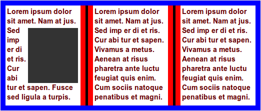
Float figure to top of natural column:
.figure { float: top }
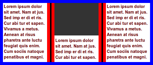
.figure { float: top; width: 50% }
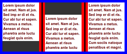
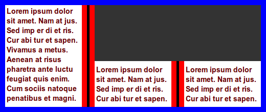
In this example, a figure naturally appears close to a column break.
There is not enough space for the figure in the first column, and it is
therefore placed in the second column, leaving white space at the bottom
of the first column.
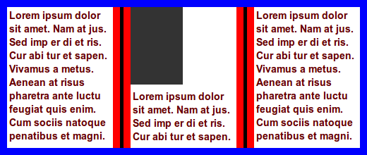
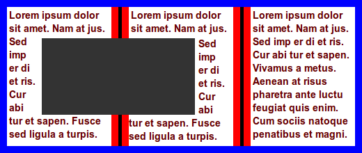
To avoid the white space, the image can be floated to the nearest edge
(in the block direction):
.figure { float: snap }
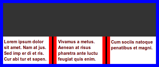
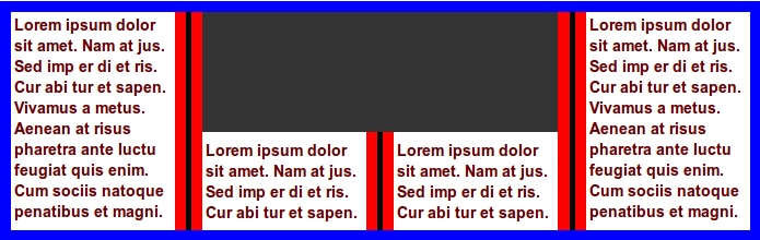
In this example, the figure is already at the nearest edge, so it does
not move. However, page floats allow subsequent content to be displayed
before the page float and the white space can therefore be filled:
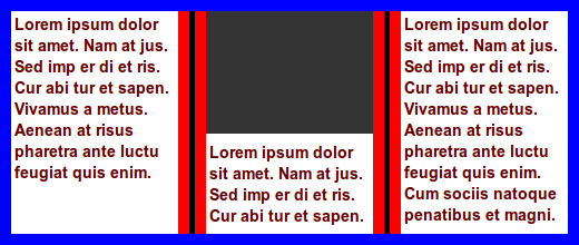
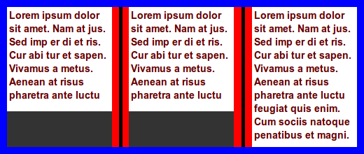
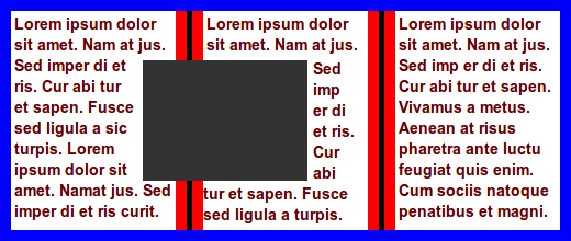
In this example, two figures naturally appear in the text flow:
A typographer would typically try to avoid single lines of text
above/below figures, which can be achieved with:
div.figure { float: snap(1.5em) }
The length value specifies the reach of the snap function; in this
example the second figure is affected, but not the first.
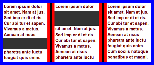
In this example, two figures naturally appear in the text flow:
To make the figures snap to the nearest edges, this code can be
applied:
div.figure { float: snap(2.5em) }
The resultant rendering is:
Float figure to top of the natural column, spanning all columns:
.figure { float: top; column-span: all }
In this example, tables will snap to the top/bottom if the top/bottom
of the border box is closer than ‘3em’ from
the top/bottom of the page/column.
table { float: snap }
table { float: snap(3em) }
table { float: snap(3em, bottom) }
table { float: snap(3em 2em, bottom) }
Do numeric values, to represent line numbers, make sense,
like for orphans/widows?
12.2. Spanning columns
The ‘column-span’ property is extended
with integer values so that elements can span several columns. If the
specified integer value is equal to, or larger than the number of columns
in the multicol element, the number of columns spanned will be the same as
if ‘column-span: all’ had been specified.
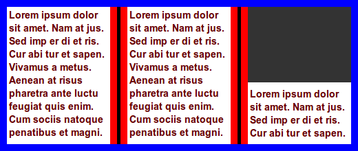
In this example, a commonly used newspaper layout is easily described:
body { columns: 3 }
img.A { column-span: 2; width: 100% }  /* image spans two columns */
.one { column-span: 2 }                /* lead paragraph spans two columns */
Further, the ‘page’ value is added to
‘column-span’ so that the page (and not
the column or element) becomes the reference.
In this example, the footer is floated to the bottom of the last page
(and not the bottom of the article element):
footer { float: bottom; column-span: page }

<article>
  ...
  <footer>...<.footer>
</article>
An alternative way to express this would be to add a
separate propertye, e.g., float-reference: column | multicol |
page
12.3.
Deferring floats: float-defer-column, float-defer-page
A page float can be deferred to a following column/page with these new
properties:
| Name:
| float-defer-column
|
| Value:
| <integer> | last | none
|
| Initial:
| none
|
| Applies to:
| page floats
|
| Inherited:
| no
|
| Percentages:
| N/A
|
| Media:
| visual
|
| Computed value:
| specified value
|
| Name:
| float-defer-page
|
| Value:
| <integer> | last | none
|
| Initial:
| none
|
| Applies to:
| page floats
|
| Inherited:
| no
|
| Percentages:
| N/A
|
| Media:
| visual
|
| Computed value:
| specified value
|
These properties specify whether page floats should appear in their
natural column/page, or in a following column/page. Values are:
- none
- the page float appears in the natural column/page
- <integer>
- A positive integer value indicates that the page float should be
displayed in a following column/page. A negative integer value indicates
that the page float should be displayed in a following column/page,
counted from the last column/page. When counting columns, the starting
point is the last column of the multicol element on the natural page.
When counting pages, the starting point is the last page of the multicol
element.
Float figure to the top of the column that follows the natural column:
.figure { float: top }
.figure { float-defer-column: 1 }
Float figure to the top of the next-to-last column:
.figure { float: top; float-defer-column: -1 }
Float figure to top of the last column of the multicol element on the
current page:
.figure { float: top; float-defer-column: last }
In combination with ‘column-span’, the
figure is floated to the top corner of the multicol element on that page:
.figure { float: top; column-span: 2; float-defer-column: last; width: 100% }
Float figure to the top of the second column, spanning two columns:
.figure {
  float: top; column-span: 2;
  float-defer-column: 1;
}
Float figure to the top right, leaving one full column:
.figure {
  float: top; column-span: 2;
  float-defer-column: -1;
}
Given that there are four columnn, the same layout would be achived
with this code:
.figure {
  float: top; column-span: 2;
  float-defer-column: 1;
}
Float figure to the top of the first column on the next-to-last page:
.figure { float: top }
.figure { float-defer-page: -1 }
Float figure to the top of the next-to-last column on the next-to-last
page:
.figure { float: top }
.figure { float-defer-column: -1 }
.figure { float-defer-page: -1 }
- last
- The page float should be displayed in the last colum, or on the last
page.
Float figure to the top of the last column on the natural page:
.figure { float: top }
.figure { float-defer-column: last }
Float figure to the last column on the last page:
.figure { float: top }
.figure { float-defer-column: last }
.figure { float-defer-page: last }
- none
- The page floats should appear in their natural column/page, if
possible.
Zero is not a legal value.
12.4. Clearing page
floats
Page floats may request to not be stacked, or to be the only page float
on a page/column through new values on the ‘clear’ property:
- top/bottom
- The page float requests to be the only page float at the top/bottom of
the column. If there is already a page float at the requested position,
the page float is moved to the next column which does not have a page
float in the requested position.
- column
- The page float requests to be the only page float in the column. If
there is already another page float on the page, the page float is moved
to the next page which does not have a page float.
- page
- The page float requests to be the only page float on the page. If
there is already another page float on the page, the page float is moved
to the next page which does not have a page float.
In this example, the two figures may appear in the same column:
.figure { float: bottom; clear: none }

<div class=figure></div>
<div class=figure></div>

In this example, the two figures will appear in different columns:
.figure { float: bottom; clear: column }

<div class=figure></div>
<div class=figure></div>
In this example, the two figures may appear at the bottom of the same
column due to clearing only at the top:
.figure { float: bottom; clear: top }

<div class=figure></div>
<div class=figure></div>
In this example, the two figures will appear in different columns due
to clearing at the bottom:
.figure { float: bottom; clear: bottom }

<div class=figure></div>
<div class=figure></div>
In this example, the two figures end up the top corner of two different
pages:
.figure { float: top; float-defer-column: last; clear: page }

<div class=figure></div>
<div class=figure></div>
In this example, the two figures request different positions, and they
may therefore end up in the same column:
.figure.one { float: top; clear: top }
.figure.two { float: bottom; clear: bottom }

<div class="figure one"></div>
<div class="figure two"></div>
12.5.
Floating inside and outside pages
Two allow content to flow to the inside and outside of a page, these
keywords are added to the ‘float’
property:
- inside
- On a right page, this value is synonymous with ‘
left’. On a left page, this value is synonymous
with ‘right’.
- outside
- On a left page, this value is synonymous with ‘
left’, On a right page, this value is synonymous
with ‘right’.
These new values do not create page floats, the are simply aliases for
‘left’ and ‘right’.
.figure { float: outside }
Should there be a way to combine float: top/bottom with
left/right?
Should there be a way to delete page floats that end up
lonesome on pages?
12.6. Wrapping
around page floats
| Name:
| float-wrap
|
| Value:
| none | wrap
|
| Initial:
| none
|
| Applies to:
| page floats
|
| Inherited:
| no
|
| Percentages:
| N/A
|
| Media:
| visual
|
| Computed value:
| specified value
|
This property indicates whether other content may wrap around a page
float:
- none
- other content may not wrap around the page float
- wrap
- other content may wrap around the page float
The ‘intrude’ value only works in
combination with one of these keywords: ‘left’/‘right’/‘top’/‘bottom’/‘top-corner’/‘bottom-corner’.
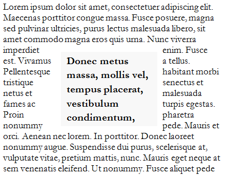
img { float: top; column-span: 2; float-wrap: wrap; width: 120%; }
In this example, the image is wider than the column and will therefore
intrude into the neighboring column. At the bottom of the middle column
is a long word that is clipped in the middle of the column gap. 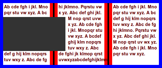
| Name:
| float-offset
|
| Value:
| <length> <length> ?
|
| Initial:
| 0 0
|
| Applies to:
| floated elements
|
| Inherited:
| no
|
| Percentages:
| see prose
|
| Media:
| visual, paged
|
| Computed value:
| one or two absolute lengths
|
This property pushes a float in opposite direction of the where it has
been floated with ‘float’. If one value is
specified, it is the horizontal offset. If two values are specified, the
first is the horizontal and the second is the vertical offset. If no
vertical value has been specified, the vertical offset is set to zero.
This property can only influence a float along an axis it has been
floated.
img {
  float: left;
  float-offset: 2em 3em;
}
In this example, the image is floated to the left. Therefore, ‘float-offset’ may
only push the element in the horizontal direction, and the vertical value
is ignored.
Negative values are allowed; a negative values will push the float in
the same direction as it has been floated with ‘float’
This property may move floats into other column than where they
naturally appear.
img {
  float: right;
  float-offset: 5px;
}
Percentage values are computed according to this formula:
  (containing-block-width - float-width) * percentage
  (containing-block-height - float-height) * percentage
Pull quotes are often centered in a column. In this
example, the pull quote is floated to the right, and then pushed back into
the center.

.pullquote {
  float: right;
  float-offset: 50%; /* 50% centers the box */
}
When negative values are set on this property, the column gap is also
part of the calculation:
((containing-block-width + 2 * column-gap) - float-width) * percentage
img {
  float: top right;
  float-offset: -50% 3em;  /* 50% centers the box */
  width: 120%;
}
img {
  float: top right;
  float-offset: -80% 2em;
  width: 100%;
}
12.8.
Overconstrained page floats
In many cases, the specified values on these properties cannot be
honored.
The number of columns is limited, and high values
therefore cannot be honored:
.figure { float: top; float-defer-column: 1000 }
A narrow screen may only have room for one column, in
which case this request cannot be honored:
.figure { float: top; float-defer-column: -5 }
In long documents, all content cannot fit on the last
page, and this rule therefore cannot be honored:
p { float: top; float-defer-page: last }
Page floats are processed in the order they appear in the source.
However, the visual order of page floats may not ne the same as the source
order.
Consider this code:
.one { float: top; float-defer-page: last; column-span: all }
.two { float: top; clear: column }

<div class=one></div>
<div class=two></div>
In this example, the first element requests to appear on the last page,
while the second element requests to appear in the natural column. If the
natural column of the second element appears on a page before the last
page, the second element will appear visually before the first.
Consider this code:
.one { float: top; float-defer-page: last; column-span: all }
.two { float: top; clear: column }

<div class=one></div>
<div class=two></div>
If all content can fit on one page, the first page will also be the
last page. The first element is processed first and is placed on top of
the first page. Then the second element is processed. It reqests a clear
top, somthing which is not possible on the first page. Therefore, a
second page is created and the first element is moved there. Even if the
first element requests to be on the last page, it will not appear there.
When resolving over-constrained layouts, the order of importance for
defined goals are:
- honor basic multi-column layout (‘
columns’, ‘column-span:
all’, ‘column-gap’ etc)
- honor ‘
column-span: <integer>’
- honor ‘
clear: top/bottom/pcolumn/page’
- honor ‘
float-defer-page’
- honor ‘
float-defer-column’
- honor ‘
float: top/bottom’
- display all content (as described by other CSS properties)
- keep the number of pages to a minimum
13. Selecting
columns and pages
13.1.
Selecting certain named pages
In CSS2, first, left and
right pages can be selected. This specification extends pages
selectors:
In this example, the first page of an article will have a pink
background, and the second will be lime:
@page funky:nth(1) { background: pink }
@page funky:nth(2) { background: lime }
article { page: funky }
The grammar of allowed arguments to nth() is the same as the nth-child()
pseudo-class.
In this example, pages in a document will cycle through pink, lime and
white backgrounds:
@page :nth(3n) { background: pink }
@page :nth(3n+1)) { background: lime }
@page :nth(3n+2)) { background: white }
13.2.
Selecting elements within pages and columns
The ‘page()’ and ‘column()’ pseudo-element allows the selection of pages,
columns, and elements within.
article::column(2n) { /* select every other column of an article */
...
}
article::page(left) { /* select all left pages in an article */
background: pink;
}
article::page(left) p { /* select all p elements that appear on left pages in an article */
text-align: left;
}
It is also possible to place the code inside @page:
These are identical:
@page :left {
{
p { text-align: left }
}
}
::page(left) p { text-align: left }
Is "left" a pseudo-class or pseudo-element? In @page,
":left" is a pseudo-class. However, when we select elements on left pages,
it acts like a pseudo-element.
@page :left {
background: pink; /* declaration applies to pages */
{
p { text-align: left } /* declaration applies to elements on page */
}
@top-center {
background: orange; /* declaration applies to margin box */
{
p { text-align: left } /* declaration applies to elements in margin box */
}
}
}
13.3. Page groups
Named pages can appear in sequence, stemming from different elements. A
sequnce of named pages with the same name is called a page group.
The ‘page-group’
property expresses whether an element starts a new page group or not.
| Name:
| page-group
|
| Value:
| auto | start
|
| Initial:
| auto
|
| Applies to:
| elements with ‘page’ value other
than auto
|
| Inherited:
| no
|
| Percentages:
| N/A
|
| Media:
| paged
|
| Computed value:
| as specified
|
This property determines whether the element starts a new page group or
not.
- auto
- The element only starts a new page group if ‘
page’ has a named page different from the the
previous element.
- start
- The element always starts a new page group.
In this example, each article starts a new page group so that the first
page of each article has a pink background.
@page funky:first {
background: pink;
}
article {
page: funky;
page-group: start;
}
Without the ‘page-group: start’ declaration,
only the first page of the first article would be pink.
14. Selecting lines
The ‘first-line’ pseudo-element selects
the first formatted line of an element. The ‘first-lines(n)’ pseudo-element selects the first n
formatted lines of an element.
article { columns: 3 }
img, p.lead:first-lines(3) {
column-span: 2;
}
<article>
<img>
<p class=lead>
<p>... <p>... <p>... <p>... <p>...
</article>
15. Conditional text
a:target-layout(attr(href url), same-page) { content: " on this page" }
a:target-layout(attr(href url), next-page) { content: " on the next page" }
a:target-layout(attr(href url), previous-page) { content: " on the previous page" }
16. Exclusions
16.1. The ‘clear-side’ property
| Name:
| clear-side
|
| Value:
| auto | both
|
| Initial:
| auto
|
| Applies to:
| floated elements
|
| Inherited:
| no
|
| Percentages:
| N/A
|
| Media:
| visual, paged
|
| Computed value:
| as specified
|
This property declares if the side of a float should be cleared of
content. Values have the following meaning:
- auto
- if the float is left-floated, there should be no content to the left;
if the float is right-floated, there should be no content to the right
!_-
- left
- there should be no content to the left of the float
- right
- there should be no content to the left of the float -->
- none
- there may be content on either side of the float
.pullquote {
float: left;
float-offset: 50%;
clear-side: none;
}
16.2. Exclusions
based on images
Exclusions are often based on shapes found in images. In this
specification, background image can carry the shape, around which text is
wrapped. The new property ‘background-exclude-level’ indicates a level in the
alpha channel of the background image(s) that defines the shape.
Here is an example that uses the background of the multicol element as
a template for exclusions. 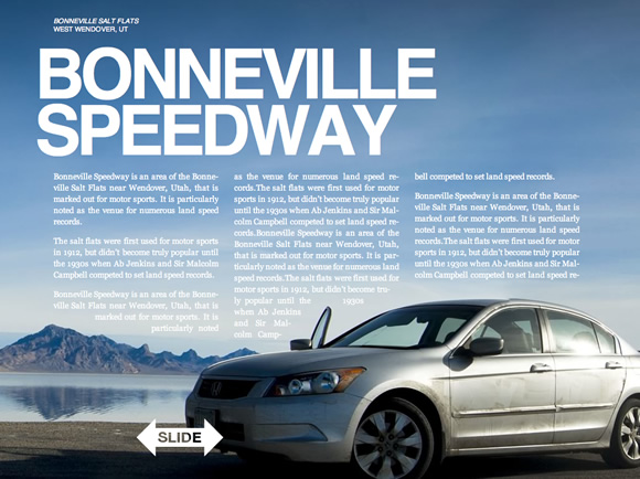
article {
padding: 4em;
columns: 15em;
background: url(nicecar.jpg);
background-exclude-level: 0.5;
}
article h1 { column-span: all } /* Bonneville Speedway */
This example is the same as the above, just with changed column widths.

article {
padding: 4em;
columns: 6em;
background: url(nicecar.jpg);
background-exclude-level: 0.5;
}
article h1 { column-span: all } /* Bonneville Speedway */
Background images can be repeated. Therefore exclusions based on images
can be repeated.

article {
background: repeat-y url(zigzag.png);
background-exclude-level: 0.5;
}
article h1 {
column-span: all;
}
16.3.
Exclusions based on rendered content
A new property. ‘exclude-level’, is
introduced to allow wraps around the rendered content of the element.
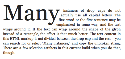
#dropcaps {
  font-size: 3em;
  float: left;
  exclude-level: 0.5;
  margin-top: -0.2em;
}
<p><span id="dropcaps">Many</span> instances ...</p>
    <p>The text ....</p>
Define behavior if both ‘exclude-level’ and ‘background-exclude-level’ is set.
Some kind of spacing behavior must be defined; ‘exclude-margin’ may be an option.
Define behavior if both ‘exclude-level’ and ‘background-exclude-level’ is set.
16.4. Exclusions
based on shapes
I suggest not having exclusions based in shapes in the first
generation of exclusions; we may want to definde shapes for CSS in general
(e.g., for borders), so we may want to wait until we have a holistic
approach.

article::column(1) {
  content-inside: circle(50%, 50%, 30%);
}

article::column(2) {
  content-outside: polygon(x1, y1, x2, y2, x3, y3, ... xn, yn);
  color: red;
}

article::column(1) {
  content-outside: circle(x, y, z);
}
article::column(2) {
  content-inside: polygon(x1, y1, x2, y2, x3, y3, ... xn, yn);
}
17. Regions
Regions are series of stylable boxes into which content can be poured.
Columns are regions that are automatically generated to contain all the
content of the the multicol element. By adding selectors for columns,
columns can be styled and positioned and thereby escape the rigid patterns
that columns naturally live in.
div.chapter::column(3)       /* the 3rd column of the element */
div.chapter::column(2n)      /* all even columns of the element */
div.chapter::column(3+)      /* all columns but the 1st and 2nd */
div.chapter::column(2,2)     /* second column on second page */
div.chapter::column(*,2)     /* all columns on the second page */
div.chapter::column(1,*)     /* the first column on all pages */
To underline the fact that columns are regions, the "region" keyword can
be used as a substitute for "column".
div.chapter::region(3)       /* the 3rd region of the element */
div.chapter::region(2n)      /* all even regions of the element */
div.chapter::region(3+)      /* all regions but the 1st and 2nd */
div.chapter::region(2,2)     /* second region on second page */
div.chapter::region(*,2)     /* all regions on the second page */
div.chapter::region(1,*)     /* the first column on all pages */
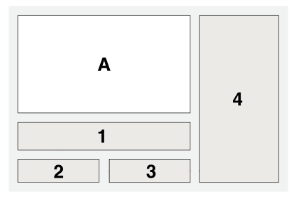
In this example, the multicol layout is changed so that the image
(which appears first in the markup) spans two columns and is floated to
the top, thereby escaping its natural column. The first column, which
holds the start of the textual content is also floated to the top,
spanning two columns, and therefore ends up just under the image. When
the first column/region is floated away, the second column will move into
its space.
article { columns: 3 }
img { column-span: 2; width: 100%; float: top }
article::region(1) {    /* selects column 1 */
  column-span: 2;
  float: top;
  height: 3em;          /* sets preferred height of region */
}

<article>
  <img ...>
  <p>...  <p>...  <p>...
</article>
div.chapter::region(1) {
  transform: rotate(6.5deg);
}
div.chapter::region(2) {
  transform: rotate(-5.5deg) translate(0, 40px);
}

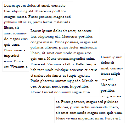
18. Regions
and Exclusions examples
article {
  columns: 15em;
}
article::region(1-3) {
  width: 15em;
  height: 15em;
}
article::region(2-3) {
  margin: 4em 0 0 -4em;
}
article {
  columns: 15em;
}
acticle::region(1-3) {
  height: 15em;
}
acticle::region(2-3) {
  margin: 4em 0 0 -4em;
}
acticle::region(2) {
  z-index: 1;
}
TBD
20. Appendix
A: Default style sheet
@page {
  counter-reset: footnote;
  @footnote {
    counter-increment: footnote;
    float: page bottom;
    width: 100%;
    height: auto;
  }
}

::footnote-call {
  counter-increment: footnote;
  content: counter(footnote, super-decimal);
}
::footnote-marker {
  content: counter(footnote, super-decimal);
}


h1 { bookmark-level: 1 }
h2 { bookmark-level: 2 }
h3 { bookmark-level: 3 }
h4 { bookmark-level: 4 }
h5 { bookmark-level: 5 }
h6 { bookmark-level: 6 }
Add grammar for functions defined in this spec.
Acknowledgments
This document has been improved by Bert Bos, Michael Day, Melinda Grant,
David Baron, Markus Mielke, Steve Zilles, Ian Hickson, Elika Etemad,
Laurens Holst, Mike Bremford, Allan Sandfeld Jensen, Kelly Miller, Werner
Donné, Tarquin (Mark) Wilton-Jones, Michel Fortin, Christian Roth, Brady
Duga, Del Merritt, Ladd Van Tol, Tab Atkins Jr., Jacob Grundtvig Refstrup,
James Elmore, Ian Tindale, Murakami Shinyu, Paul E. Merrell, Philip
Taylor, Brad Kemper, Peter Linss, Daniel Glazman, Tantek Çelik, Florian
Rivoal, Alex Mogilevsky, Simon Sapin, Cameron McCormack, Liam R E Quin,
Peter Moulder, Morten Stenshorne, Rune Lillesveen, Lars Erik Bolstad,
Anton Prowse, Michel Onoff
References
Normative references
-
- [CSS3LIST]
- Tab Atkins Jr. CSS Lists
and Counters Module Level 3. 24 May 2011. W3C Working Draft.
(Work in progress.) URL: http://www.w3.org/TR/2011/WD-css3-lists-20110524
Other references
-
- [CSS2]
- Ian Jacobs; et al. Cascading Style
Sheets, level 2 (CSS2) Specification. 11 April 2008. W3C
Recommendation. URL: http://www.w3.org/TR/2008/REC-CSS2-20080411
- [CSS3PAGE]
- Melinda Grant; et al. CSS Paged
Media Module Level 3. 14 March 2013. W3C Working Draft. (Work
in progress.) URL: http://www.w3.org/TR/2013/WD-css3-page-20130314/
Index
- bleed, 6.
- bookmark-label, 7.2.
- bookmark-level, 7.1.
- bookmark-state, 7.3.
- bookmark-target, 7.2.
- clear-side, 16.1.
- float-defer-column, 12.3.1.
- float-defer-page, 12.3.2.
- float-offset, 12.7.
- float-wrap, 12.6.
- marks, 6.
- named strings, 1.
- page-group, 13.3.
- running elements, 1.
- string-set, 1.1.1.
Property index
| Property
| Values
| Initial
| Applies to
| Inh.
| Percentages
| Media
|
| bleed
| <length>
| 6pt
| page context
| no
| refer to width of page box
| visual
|
| bookmark-label
| <content-list> | none
| none
| all elements
| no
| N/A
| all
|
| bookmark-level
| none | <integer>
| none
| all elements
| no
| N/A
| all
|
| bookmark-state
| open | closed
| open
| block-level elements
| no
| N/A
| all
|
| bookmark-target
| none | <uri>
| none
| all elements
| no
| N/A
| all
|
| clear-side
| auto | both
| auto
| floated elements
| no
| N/A
| visual, paged
|
| float-defer-column
| <integer> | last | none
| none
| page floats
| no
| N/A
| visual
|
| float-defer-page
| <integer> | last | none
| none
| page floats
| no
| N/A
| visual
|
| float-offset
| <length> <length> ?
| 0 0
| floated elements
| no
| see prose
| visual, paged
|
| float-wrap
| none | wrap
| none
| page floats
| no
| N/A
| visual
|
| marks
| [ crop || cross ] | none
| none
| page context
| no
| N/A
| visual, paged
|
| page-group
| auto | start
| auto
| elements with ‘page’ value other than auto
| no
| N/A
| paged
|
| string-set
| [[ <identifier> <content-list>] [, <identifier>
<content-list>]* ] | none
| none
| all elements
| no
| N/A
| all
|